When transforming your home into a stylish space it can be difficult to know exactly what you’re doing. And chances are, you’re probably making some big interior design mistakes without even realising. There are a few common rules followed by designers to avoid making any interior faux pas and today we’re sharing them with you in this article.
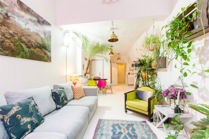
Artificial plants
Artificial plants can look cheap and they’re a magnet for dust. Fake faddy flowers never look as good as the real thing. So, if you’re unable to keep topped up with fresh flowers every week, small plants such as Pothos, Aloe Vera and English Ivy, are the perfect answer.
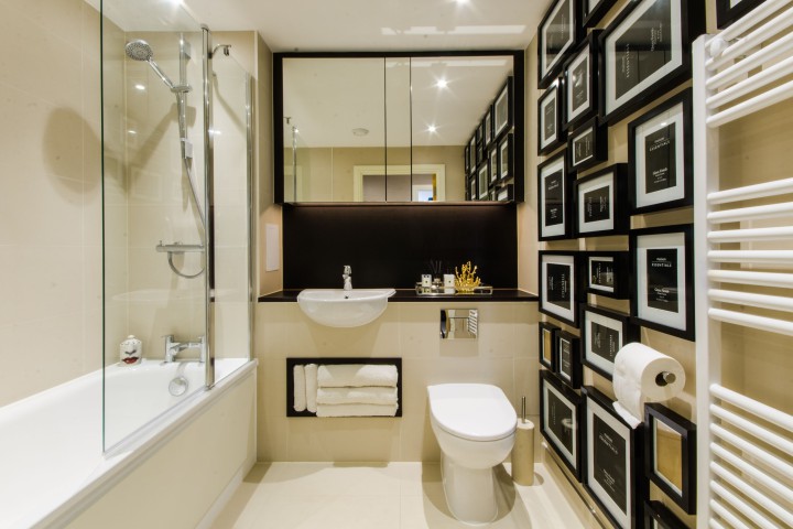
Photo overload
Instead of displaying your family photos on your entrance cabinet, opt for a wall gallery instead. It is a good solution to gain more space and avoid having dusty clutter that you have to clean each week. Too many photos? Select your favourite ones and keep the rest in photos albums and store them on a bookshelf.
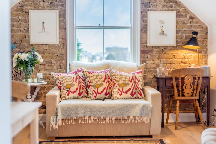
Countless pillows on the sofa
Pillows can be practical and decorative, but they shouldn’t obstruct a guest’s ability to sit on the sofa. Many interior designers use the rule of three. This magic number works for any type and size of sofa.
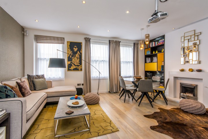
Too many colours and patterns in one room
Express your personal taste with style in small amounts. Do not use the same colour and patterns for furniture and decorative objects in your living room. The secret is to mix colours and materials without exceeding the number three. You should have two light colours and a shiny one to contrast.
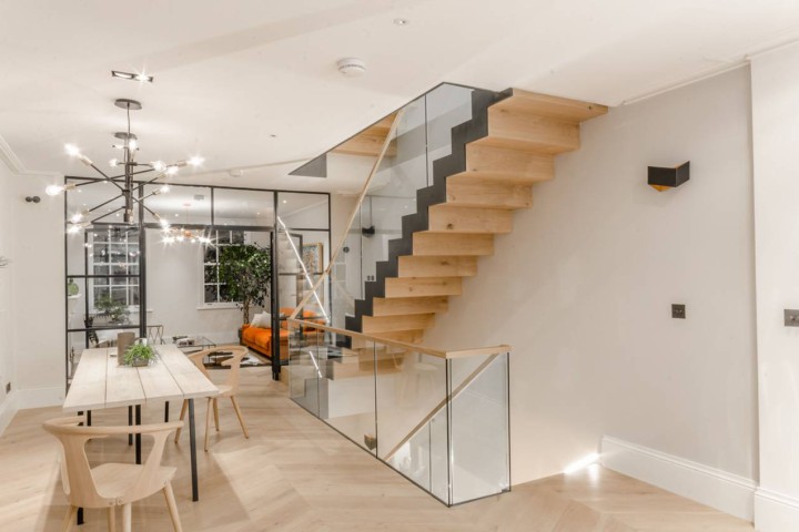
Poor lighting
No matter how great your room looks, if the lighting is poor, your room will not feel welcoming. Light is important for our mood and needs to be functional and decorative at the same time. Opt for glass doors and walls, paint your room in white and use clear furniture to make your room feel bigger and brighter.
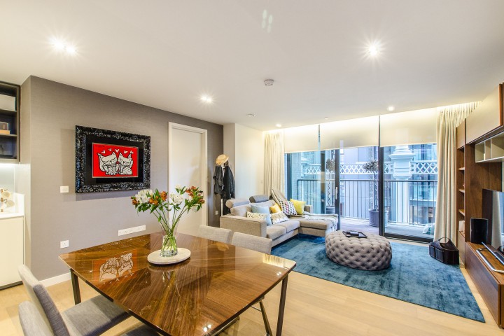
Artwork hung too high or too low
One of the most common mistakes we make is hanging artwork above or below eye level. A rule of thumb is to hang your artwork in the centre of your eye line. Although this may feel a bit low, it’s the best way to display your artwork with plenty of space around the piece.
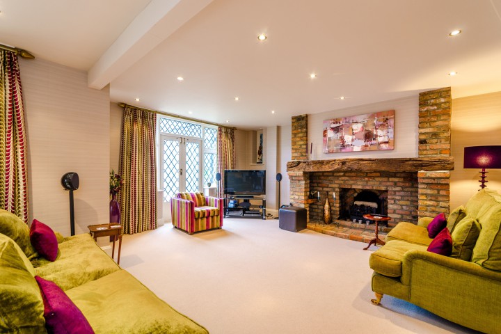
Curtains swiping the floors
It’s quite frequent to see curtains dragging on the floor, but this is a big interior design no no. You should always leave 1-2cm (1/2 inch) between the curtains and the floor to allow them to hang freely. In addition, it keeps them away from dust and are easier to draw.
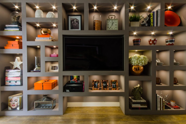
Accumulating clutter
If you like collecting things, you should not leave your clutter gathering dust on your shelves. If you want to enhance your collection, use a cabinet or picture boxes to display them or turn them into a feature of the room.
Rugs that are too big or too small
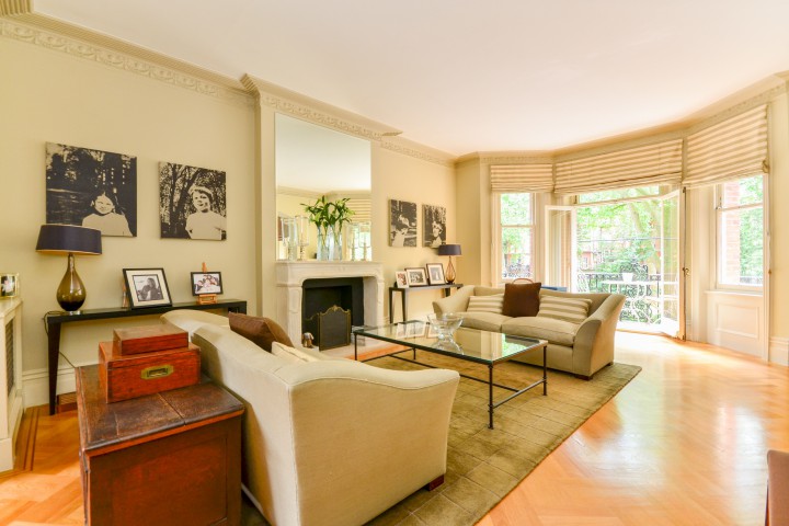
The legs of your furniture should be on and not off the rug. In terms of size, any rugs should be appropriate to the size of the room. Small rugs that float in the middle of a room look cheap and in most cases, worse that having nothing on the floor. Vice versa, opting for a large rug which covers three quarters of the living room looks like you did not bother to take any measurements before you bought it.
Lack of privacy in the bathroom
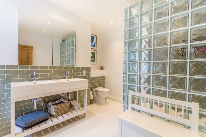
Separate your bathroom so that all family members can use the space at once and reduce waiting time when brushing your teeth in the morning. The sink basin should be in a shared space so people can easily access it. Separate the toilet and shower with frosted partitioned walls to give privacy, while making the space feel bigger.